
Why Responsive Website Development Is Non-Negotiable in 2025
In today’s digital-first world, your website is often the first and most important interaction customers have with your brand. But what happens when a potential client lands on your site via their mobile phone, only to find buttons that don’t click properly, content that overlaps, or images that load poorly? You lose them—instantly.
Welcome to 2025, where user expectations are higher than ever, device diversity is growing, and responsive website development is no longer a luxury—it’s a necessity.
This article dives into why responsive website development is non-negotiable in 2025, covering user behavior trends, SEO implications, business performance, and the future of web technologies.
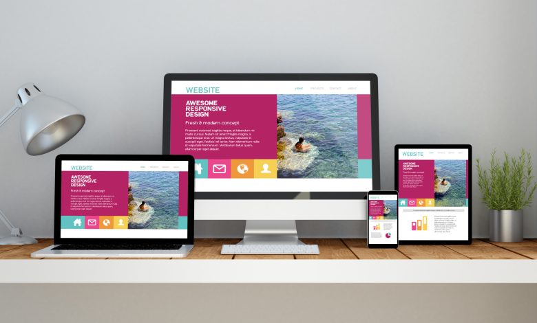
📱 What Is Responsive Website Development?
Responsive website development is the process of creating websites that automatically adapt to the screen size, orientation, and platform of the device being used—be it a smartphone, tablet, laptop, or desktop monitor.
Instead of having separate mobile and desktop sites, responsive websites use flexible grids, media queries, and scalable elements to deliver a seamless experience on all devices.
🌍 The Device Revolution: Why It Matters in 2025
The number of internet-connected devices continues to explode. According to recent data:
-
Over 75% of global web traffic comes from mobile devices.
-
The average person uses 3–4 devices daily.
-
Smart TVs, foldable phones, and wearables are now mainstream.
-
In developing regions, mobile is the primary access point to the internet.
In 2025, your website must not only “look good” on a desktop—it must perform flawlessly everywhere.
🚨 The Consequences of Ignoring Responsive Design
1. Higher Bounce Rates
Users leave unresponsive websites in seconds. If your mobile site is hard to navigate or doesn’t load properly, visitors bounce—and they won’t return.
2. Lower SEO Rankings
Google uses mobile-first indexing, meaning your site’s mobile version is prioritized for ranking. A non-responsive site = poor mobile experience = lower rankings.
3. Lost Revenue
If users can’t easily browse or make a purchase on your site via their phone, you’re bleeding conversions. Whether you’re an eCommerce brand or a local plumber, every interaction matters.
4. Damaged Brand Perception
In 2025, users expect modern, intuitive design. A clunky, unresponsive website reflects poorly on your brand’s professionalism and credibility.
📈 The Business Case for Responsive Website Development
Let’s break down how responsive design directly benefits your business in measurable ways:
✅ 1. Better User Experience (UX)
Responsive websites adapt to the user’s needs. Buttons resize, text flows properly, and interactions feel natural. Better UX = more time on site = more conversions.
✅ 2. Improved SEO Performance
Google favors mobile-friendly, fast-loading websites. Responsive design improves:
-
Core Web Vitals
-
Page load time
-
Mobile usability
-
Bounce rate
✅ 3. Lower Maintenance Costs
Unlike separate desktop and mobile websites, responsive websites require only one codebase. That means:
-
Faster updates
-
Easier troubleshooting
-
Reduced long-term costs
✅ 4. Increased Conversions
From newsletter signups to product purchases, a seamless experience across devices ensures fewer drop-offs and more successful actions.
✅ 5. Future-Proofing Your Site
New screen sizes and devices are emerging constantly. Responsive design ensures your site is ready for the next iPhone, tablet, or smart device.
🔍 Real-World Examples: The ROI of Responsive Websites
🛍️ Case Study: eCommerce Brand in Europe
A fashion retailer rebuilt their site responsively and saw:
-
35% increase in mobile transactions
-
21% reduction in bounce rate
-
48% faster page load time
🧑⚕️ Case Study: Local Healthcare Clinic
After switching to a responsive WordPress website:
-
Form submissions increased by 65%
-
Mobile visitors rose by 40%
-
Page views per session doubled
💡 Key Elements of Effective Responsive Website Development
If you’re ready to build or revamp your site, here are core elements that make responsive design truly effective in 2025:
1. Mobile-First Approach
Design your website starting with the smallest screens. This ensures:
-
Clean content hierarchy
-
Simplified navigation
-
Essential functionality upfront
📌 Tools: Figma, Adobe XD, or Sketch with mobile-first artboards.
2. Flexible Grid Systems
Use CSS frameworks like:
-
Bootstrap 5
-
Tailwind CSS
-
Foundation
These systems allow your layout to fluidly scale with screen size.
3. Scalable Images and Media
Use CSS max-width and modern image formats like WebP. Use srcset for different screen resolutions.
✔ Tools like ShortPixel and Imagify can compress images without quality loss.
4. Responsive Typography
Font sizes should adapt using em, rem, or CSS clamp() so users don’t have to zoom in or squint.
5. Media Queries & Breakpoints
Use media queries to apply styles based on screen width:
Standard breakpoints:
-
320px – small phones
-
768px – tablets
-
1024px – small desktops
-
1440px+ – large screens
6. Touch-Friendly Navigation
Avoid tiny buttons and crowded layouts. Use:
-
44x44px minimum button size
-
Large, tappable menu items
-
“Thumb zone” placement for mobile devices
7. Responsive Forms
Forms must be:
-
Easy to complete on phones
-
Keyboard optimized
-
Auto-filled where possible
💡 Use tools like WPForms, Typeform, or Gravity Forms with mobile-friendly templates.
8. Performance Optimization
Page speed is crucial on mobile. Use:
-
Lazy loading
-
Minified JavaScript and CSS
-
CDN (e.g., Cloudflare)
-
Server-side caching
🚀 Tip: Run your site through and aim for 90+ on mobile.
🌐 Responsive Design & SEO in 2025
Responsive design is deeply connected to search engine performance. In fact, Google explicitly recommends responsive design over mobile-specific URLs.
SEO Benefits:
-
Improved mobile usability (a direct ranking factor)
-
Faster load times → better UX → improved rankings
-
Single URL structure (helps with link building and sharing)
-
Better engagement metrics (bounce rate, session duration)
📊 Tools for Testing Responsive Websites
Make sure your site looks and works great across all devices using these tools:
| Tool | Features |
|---|---|
| Google Mobile Test | Quick check for mobile-friendliness |
| Responsively App | Simulate multiple devices at once |
| BrowserStack | Live testing on real devices |
| LambdaTest | Cross-browser compatibility testing |
| Chrome DevTools | Free device emulation in browser |
🔮 Future Trends in Responsive Design (2025–2030)
🔸 AI-Powered Personalization
Sites adapt layout and content based on user behavior, location, or device.
🔸 Voice & Gesture Interfaces
Designing for voice commands and minimal visual UIs is becoming critical.
🔸 Progressive Web Apps (PWAs)
Offer app-like experiences directly in browsers—responsive by default.
🔸 Foldable & Dual-Screen Devices
Websites must handle variable screen orientations and resolutions gracefully.
🚀 Ready to Go Responsive?
If your current website is:
-
Clunky on mobile
-
Slow to load
-
Hard to read or navigate
-
Failing SEO benchmarks
…it’s time to go responsive.
✅ Final Checklist for Responsive Website Success
Use this list to ensure your site is built for modern responsiveness:
✅ Mobile-first layout
✅ Flexible grids and images
✅ Scalable typography
✅ Speed optimization (especially on mobile)
✅ SEO-friendly structure
✅ Accessible navigation
✅ Forms and CTAs work across devices
✅ Real-world testing on multiple screens
✅ Easy-to-maintain codebase
✅ Integrated analytics and tracking
🧩 Final Thoughts
In 2025, having a responsive website is no longer a “nice to have”—it’s the standard baseline for digital success.
Responsive design ensures:
-
You don’t alienate mobile users
-
You rank higher on Google
-
Your brand feels professional
-
Your business stays competitive
Investing in responsive website development is not just about technology—it’s about putting your users first, wherever and however they interact with your brand.